Tuesday, December 11, 2012
Game Drawing
In art class we were given board games to draw with watercolor. First, we drew the drawing with watercolor. The watercolor was then blended with colored pencils giving it highlights. This was fun because we got to use vanishing points and overlapping that we learned earlier in the week. A horizon was created from the vanishing points. The overlapping created shadows which were drawn at a specific angle to create a more realistic drawing. The shadows made the drawing look like you were looking at it from perspective. I feel good about my drawing but I think I could of done better on it. My shadows could of been more exact as well as my boxes. I didn't have many things that worked/didn't work so I am happy with that. If I could start this project over I would use more precise calculations. Overall I learned about vanishing points, overlapping, perspective and value from this project.
Monday, November 19, 2012
Anamorphosis
 In the lab we gathered an illustration online that would be good for transforming. Next, we transferred it over to Photoshop and made the illustration taller and fatter at the top. This would create an allusion from the side making the illustration look normal. I then copied the illustration onto grid paper using the exact scale. The illustration would be viewed from the ground at an angle. Thus making the picture look normal and showing shadow. I tried to make the illustration look as good as possible by coloring neat. My picture was good for reflection creating a better end result.
Stencil Photos
 In the lab we gathered a few photos online we may use for our stencil. We then imported the photo on to Photoshop. Here I changed the picture into black and white. I then looked over the photo and printed it off to bring back to the room. We got back to the room and began working on this large project. I first cut a piece of wood into four pieces for a frame. I made the frame by nailing the pieces of wood together then stapling cardboard onto the back of the frame. Next, I copied my stencil onto a larger piece of paper by using a projector. I cut many white and black pieces of paper out of a book next then glued it down to the cardboard for a more interesting background.
Monday, October 22, 2012
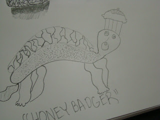
I am actually very happy with my artwork. I did not think I would do very good with the toad but it ended up very nice in my opinion. The background blended very well with the the toad itself. I added patterns to the toad to make it more interesting. It added more texture to the print. I used the negative space to outline the toad. The positive space takes up the majority of the print. I like the white paint on the black paper. I tried to keep the print very neat. I believe I accomplished that very well. I took my time when printing the lino-cut onto the paper. This created an even and more solid color print. I did not achieve depth too great but I was not thinking that completely through before I started the project. I was thinking more about my main drawing than background. I had an obstacle by making the background late but there was no obstacles other than that. I thought this project was fun and would not mind doing something like it again.
Thursday, October 4, 2012
Interactive Chalk Mural
This is the chalk mural my group and I created. We thought it turned out good for how far behind we started. We also had multiple struggles to start out including rain washing away part of our original drawing. Our group worked together well and split the amount of drawing evenly. We also switched jobs everyday so we didn't have to do draw the same part of the drawing. I thought our group worked together well overall. It was important that we collaborated well because this project took up lots of time and was difficult. Farrell, our team leader, picked a good team that was focused most of the time. We finished the last two days strong and had a good ending result. I think our project was successfull for the most part. We started off slow because we didn't exactly know what we were doing at the beginning. The more and more the project came along we just started to make it our own and finally it was coming along. I'm proud of our team and the way we finished the project. One thing that made this project was so cool was that we could involve the whole school. It was an interactive assignment that let others "act" out our art.
Friday, September 21, 2012
Value Portraits
My process began by tracing the picture of her face. I then traced it again on to a seperate piece of paper. I then began to shade her hair and then her face. I found different values in the portrait by looking at the lighting on her face. I believe Mr. Sands took the picture in a certain lighting on purpose. Characteristics like her hair gave certain shadows on her face a detailed look. I tried to achieve a large range of values on my drawing. I tried to slowly shade lighter so my shading would be more realistic. If I would of drawn a line then stopped shading when I got to the line it would not of been very realistic, shadows slowly fade in real life. I could of done better like always but I still like how I did on my drawing. I tried to be as neat as possible with a small amount of smear marks. I am happy with the way I did on this drawing. Drawing the hair took a large amount of time and put me back a little. I just stayed focused and didn't let the time lost effect how much detail I put in the drawing. Other than that I did not have any other obstacles while drawing this portrait.
Thursday, September 6, 2012
Moss Art
 Last Friday we drew moss art. It smelled horrible and was hard to paint. Mr. Sands mixed buttermilk, a little sugar, corn syrup and moss together to create the graffiti. We painted it on a small wall outside of the school. The air was humid and the wall was hidden from the sun, therefore giving moss the great growing space. I am excited to see what will happen. Will it grow? Only time will tell.
Cartoon Bones Drawing
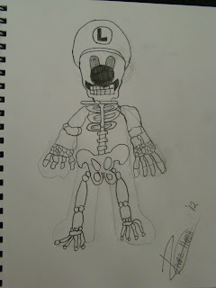
I picked Luigi for my cartoon because he is my favorite Mario character. I have to admit that I did not like drawing him too much. His arms and legs are big boned and it was hard to change the proportions. My sketch came out okay but it was hard to draw Luigi smoothly. I think if I printed off a taller, larger character it would of been a much more enjoyable draw but this was a good challenge.
Subscribe to:
Comments (Atom)


